Which? CELL

Which? CELL

Creating culture of shared knowledge and efficient collaboration

Basic Project Info

Not having a single design point of reference made it hard for the company to keep their products concise. I initiated a creation of a multi-disciplinary team of UX designers, UI designers and FE developers where I was initially assigned a co-lead but later took sole responsibility for leading the project. We delivered CELL – Component & Experience Language Library.

My role Project Lead, UX Designer
Platform Cross-platform and cross-device
Industry Industry agnostic
Period Sep 2015 - Sep 2016
(side project)
Contract Full-time employee of Which?
(Feb 2015 - Sep 2016)

Background

Which? is the largest consumer body in the UK with a growing base of approximately 1 million subscribers to their online and offline services. Since its start at 1957, Which? magazines have been known for independent product and service reviews but the organisation is currently active in many consumer right related areas – from campaigning for consumer rights to providing independent money advice to selecting a university, birth choice or elderly care provider.

As most traditionally publishing companies, Which? is currently undertaking a digital transformation.

The Challenge

Which? has multiple responsive websites, a tablet app and multiple mobile apps whose design is scattered across devices and services. This is due to multiple designers working on different elements over past years but mainly because of a missing central repository of UX and UI guidelines and a component library.

Current state - multiple websites, scattered design

The Team & My Role

Since I joined Which? I advocated creating a design language and a UI library that all teams could access and share to ensure that design and implementation across all Which? propositions are consistent and up-to-date.

I initiated the creation of a multi-disciplinary team of UX designers, UI designers and Front-end developers where I was initially assigned a co-lead but later took sole responsibility for leading the project. I also took on the role of a project manager and through a series of workshops and weekly sessions kept the momentum for the project high.

Target Audience

1. Internal

  • Primary: UX designers, UI designers, Developers
  • Secondary: Business stakeholders

2. External

  • Third-party contractors

Process, methods & tools

I followed agile methodologies and set up weekly sprints and weekly review meetings.

We used Slack to communicate ideas and discuss related topics in between meetings.

I also set up and managed a Trello board, in which we kept track of all components, interactions, and guidelines that needed to be developed.

Methods

Literature review & Platform best practices and standards

We always started by understanding industry standards, relevant platform standards (Android, iOS, responsive web) and then performed a literature review while looking for new trends online on influential blogs and online magazines.

Collaborative development

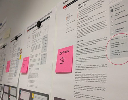
My aim was to create a sense of ownership in the team as well as to promote a common goal. We trialed different ways of working but found the most effective method was having one UI designer and one UX designer working in tandem over a week or two to explore a given guideline or component.

A lively discussion would often spring up on Slack around various options that designers were considering. This kept other designers and developers in the loop and allowed them to be part of the process.

In the weekly review meetings, the whole team would have a final say on whether the guideline or component should become part of the library.
Once agreed, the UX&UI pair in charge would document and write everything up so that everyone could benefit from the new design element.

Developing an HTML prototype
Developing a HTML prototype

Two development phases

Phase 1 – UX & UI Guidelines

The aim of this phase was to translate already developed Which? UX principles to more specific UX and design guidelines.

We started by defining core guidelines like responsive grids, use of colour, or touch target sizes. Then we moved to more advanced topics like animations and transitions.

It was key to complete the guidelines in full before starting applying them on individual UI components – this ensured a coherent and consistent design throughout the new library.

Example Guideline pages

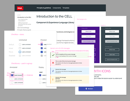
Phase 2 – Component Library

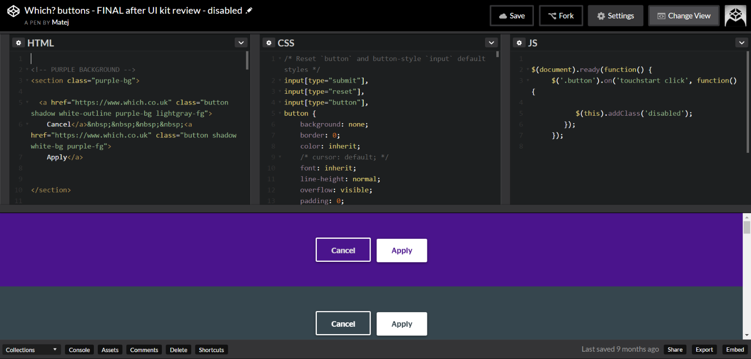
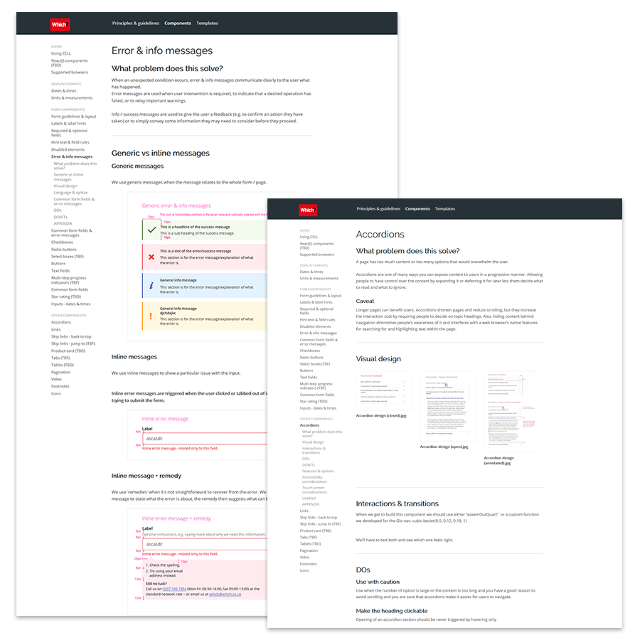
We then moved to designing individual UI components. The component library includes precise annotated designs of individual UI elements, UX recommendations of how to use them in context (Dos and Don’ts) and also touch screen and accessibility considerations.

Example Component pages

Tools used

Project management

  • Trello
  • Slack

Design & Development

  • Pencil and paper
  • Axure
  • InVision
  • Sketch
  • Adobe Illustrator & Photoshop
  • Zeplin
  • HTML, CSS, JS, Jquery

Solution

CELL (Component & Experience Language Library) was collectively selected as a name for the library.

A responsive website includes three main sections – Principles & Guidelines, Components, and Templates. These are being gradually populated with content as the project progresses.

Which? CELL website

Impact

  • Culture shift – collaboration across disciplines
  • No duplicated work on same experiences and UI elements
  • It has become a reference point for designers and developers
  • This was a long-term project and as far as I know, it is still being developed further and designers still use most of the processes and tools I put in place