QS Heptagon

QS Heptagon

A novel data visualisation for periodic pattern discovery

Basic project info

In this project, I proposed a holistic model of personal informatics data visualisation (e.g. fitness data). I then used the model to develop a set of novel visualisations of physical activity data. I also suggested an evaluation plan to assess the effectiveness of the new visualisation.

My role Researcher, Data Scientist, Designer
Platform Mobile app
Industry Personal Informatics (Quantified Self), Personal Fitness Data
Period One week in Jan 2017
Contract Academic assignment

Background

This project took place over a period of one week as part of the Future Interfaces module that I completed as part of the Human-Computer Interaction (HCI) Master’s program at University College London.

UCL Interaction Centre that delivers the HCI program is a world leading Centre of Excellence in Human-Computer Interaction.

The Challenge

In the Future Interfaces module, we explored topics from virtual and augmented reality to personal informatics to public displays and IoT.

A brief for this project asked us to combine one of the topics covered in the module and data visualisation techniques. Lastly, we were supposed to propose an evaluation study that would assess the effectiveness of the new visualisation.

My Role

This was an individual project – I conducted a literature review, thematic analysis, design work and wrote up the report.

Target Audience

Young professionals were considered as primary target audience since most participants recruited through interest Quantified Self (QS) websites for Li et al.’s study were 26-30 years old. But the visualisation is not strictly limited to one audience only.

Process, methods & tools

For my project, I selected personal informatics (quantified self) and found an open FitBit dataset.

It was a week-long research and design work grounded in a critical literature review.

Phase 1 – Literature review

I went through about 30 academic papers and books to learn more about Quantified Self (QS) in general and about current advancements in QS visualisations.

I soon realised that, although there were models describing the life cycle of personal informatics, I didn’t encounter a model of what visualisations should be provided to the user in various contexts and stages.

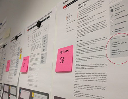
To consolidate all the insights from the literature review phase, I decided to carry out a thematic analysis. This led me to devise my own framework that I called a “Model of visualised self”.

Conducting a thematic analysis of QS literature

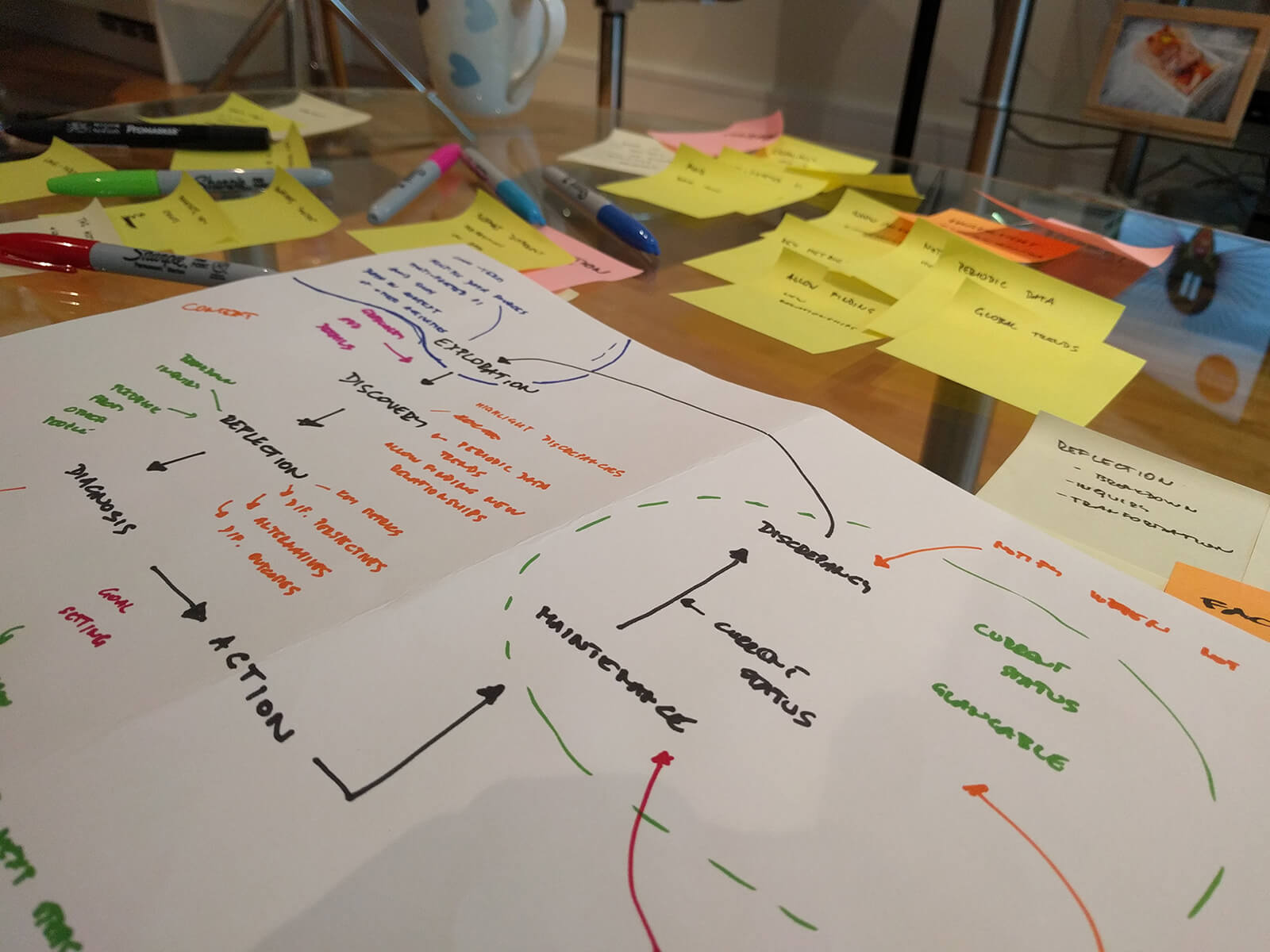
Phase 2 – A model of visualised self

A model of visualised QS

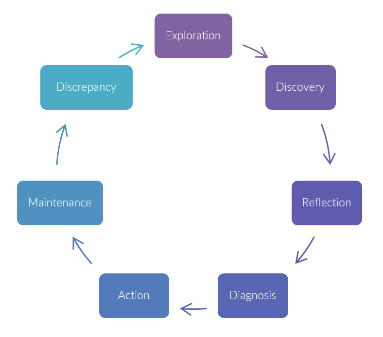
The model builds on the insights made in the reviewed papers and consists of seven stages - these are by no means clearly separated, however, they have distinct characteristics:

1. Exploration

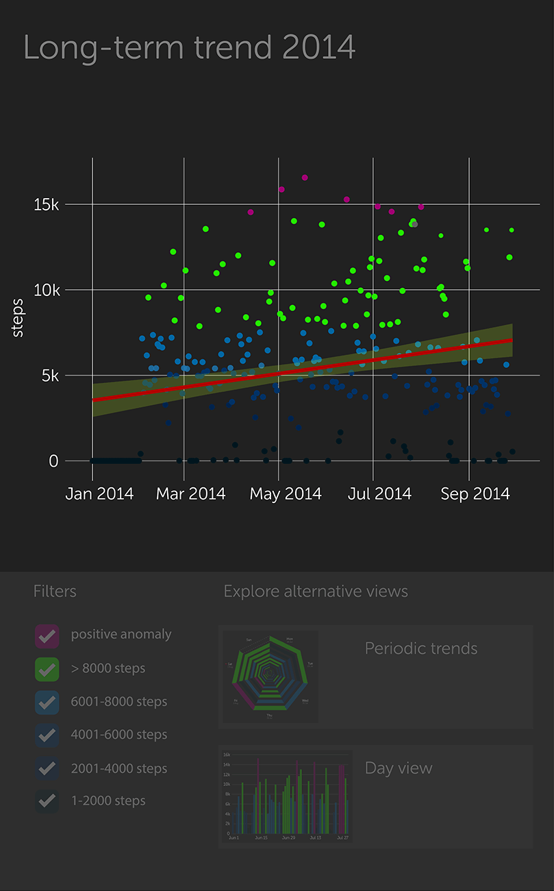
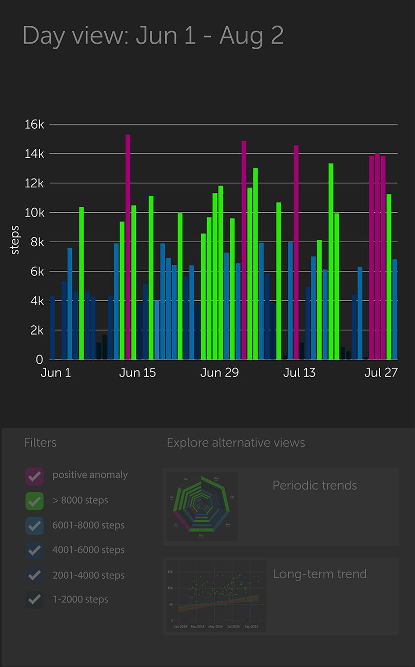
Allow users to explore long-term time series data [10], it should be presented in the context of other QS data streams creating a coherent multi-faceted view [10,11] and avoiding data silos. Start with a simple view that can be gradually enhanced with more details on demand [3].

2. Discovery

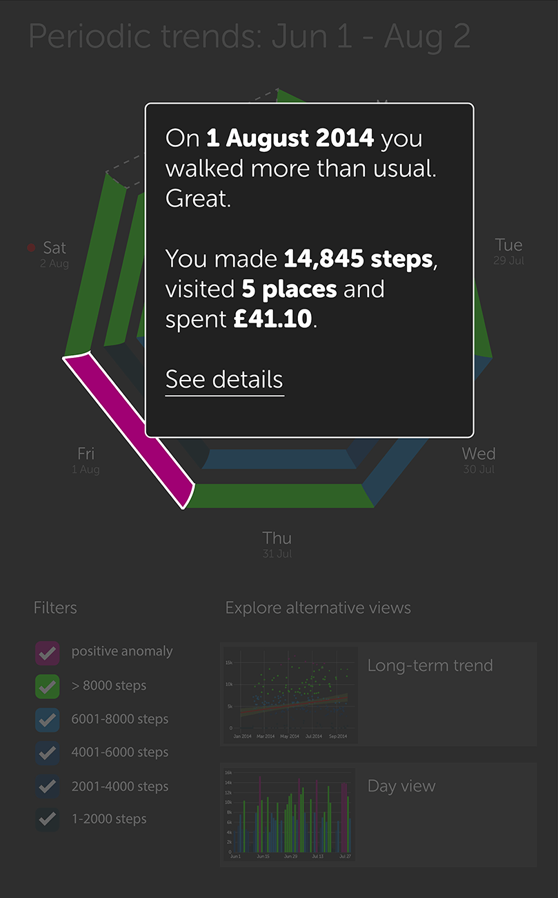
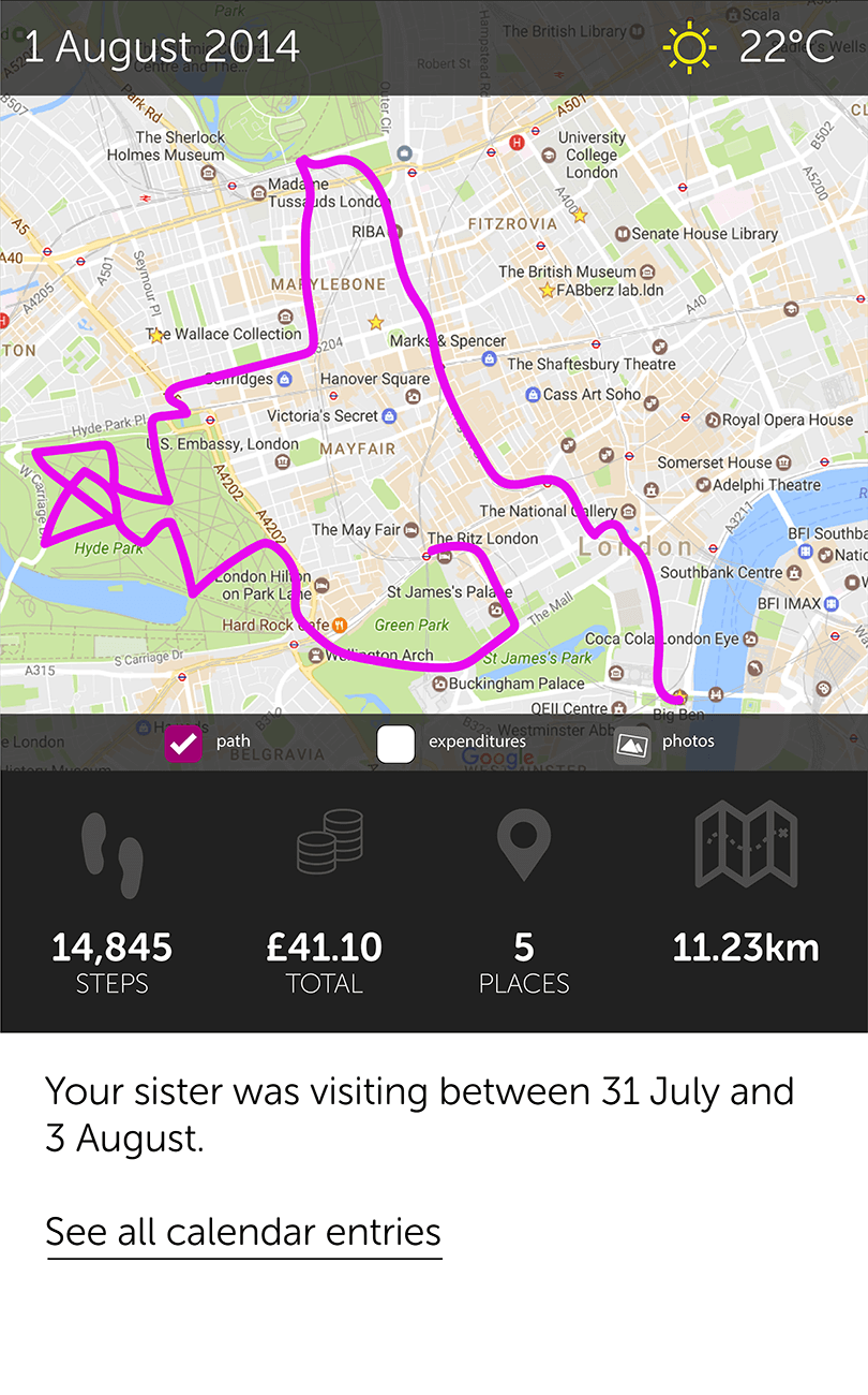
Facilitate discovery by highlighting anomalies and discrepancies in the data [6]. Showing global trends, periodic patterns, and multiple visual representations of the same data enables new interrelationship discoveries [3,6]. User history, goals and  contexts are all important  factors that help seeing the data in new ways [11]. Make it easy to tag and annotate events to create a richer picture of the context surrounding an event – richer information can lead to uncovering hidden relationships [12].

3. Reflection

Support viewing results from different perspectives [1] by presenting surprising or puzzling facts – e.g. compare user performance with friends, family members or general public [1]. Bring past records into user’s attention unexpectedly to promote reflection [6]. If possible, model and show alternative outcomes of different goal-achieving scenarios [6]. Present goals and key metrics set by the user to help them reflect upon data. Allow insights to be shared with friends or public and facilitate feedback from them.

4. Diagnosis

After exploring the data and reflecting on discoveries, the users are ready to diagnose the causes of discrepancies. Allow them to annotate the data and store the discoveries and insights they have made. Assist them in turning these into actionable points [3].

5. Action

Support users in adjusting, setting and achieving their goals [3,11].  Suggest next steps. Gamification can motivate action – e.g. collecting rewards [16], taking care of pets [13] or plants [2,8] or use of avatars [7,15] were shown to be an effective approach to behaviour change facilitation. Involvement of family members has been shown to improve chances of a positive change [14].

6. Maintenance

Display current status and make data interpretable at a glance [3,11]. Offer a simplified view but allow for gradual enhancement [3]. Use positive reinforcement – users do not want to see bad results [10] – abstract representations of the data may be perceived better than charts [5] or living metaphors [2,8,13]. Take into account that users will forget or skip measurements and do not punish them for it [4].

7. Discrepancy

Support users by notifying them about discrepancies between their current status and their goals [11].

Phase 3 – Design focus & Rationale for proposed visualisations

I focused on the Exploration and Discovery phases described in the model above as these presented the biggest opportunity for a novel approach.

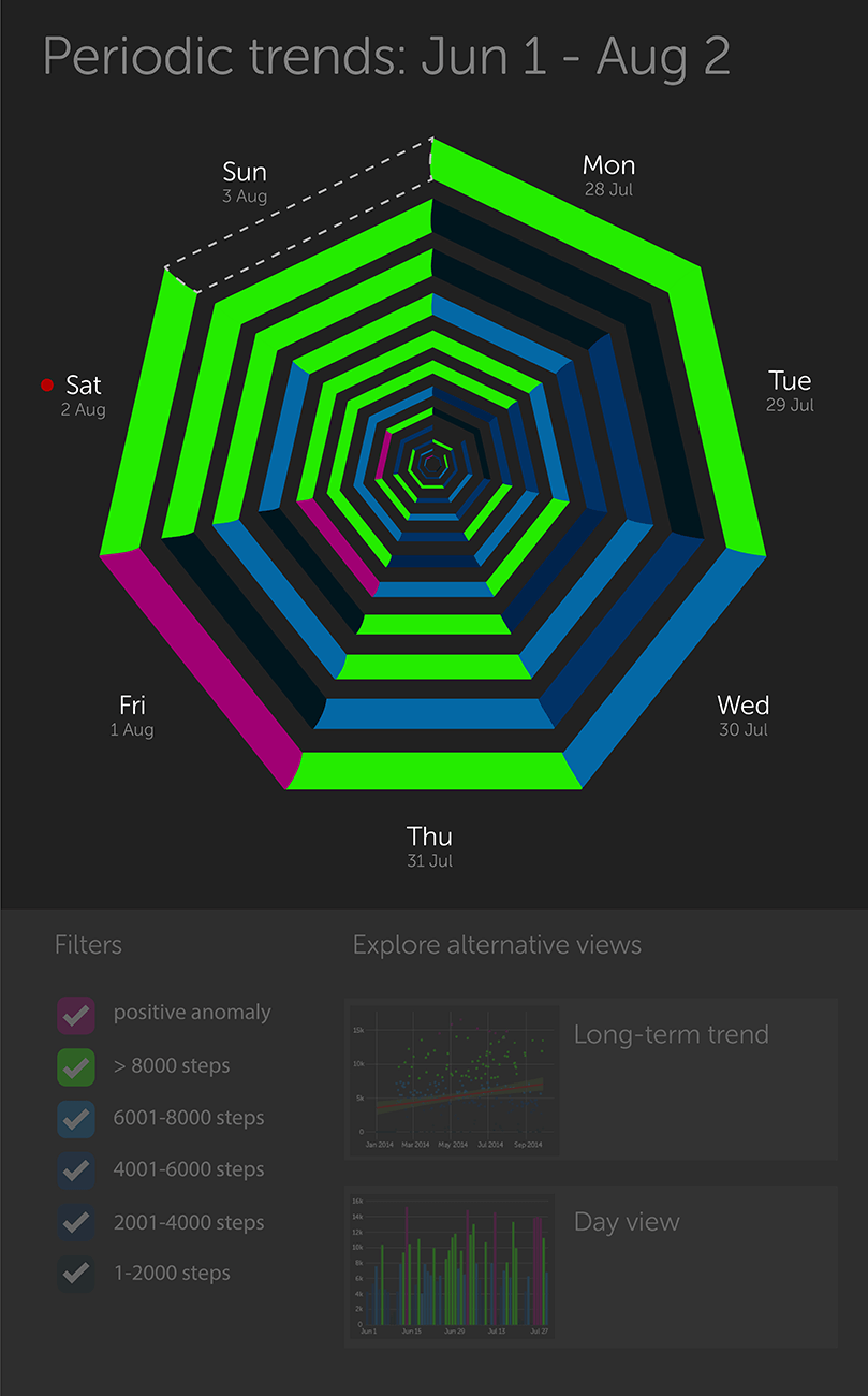
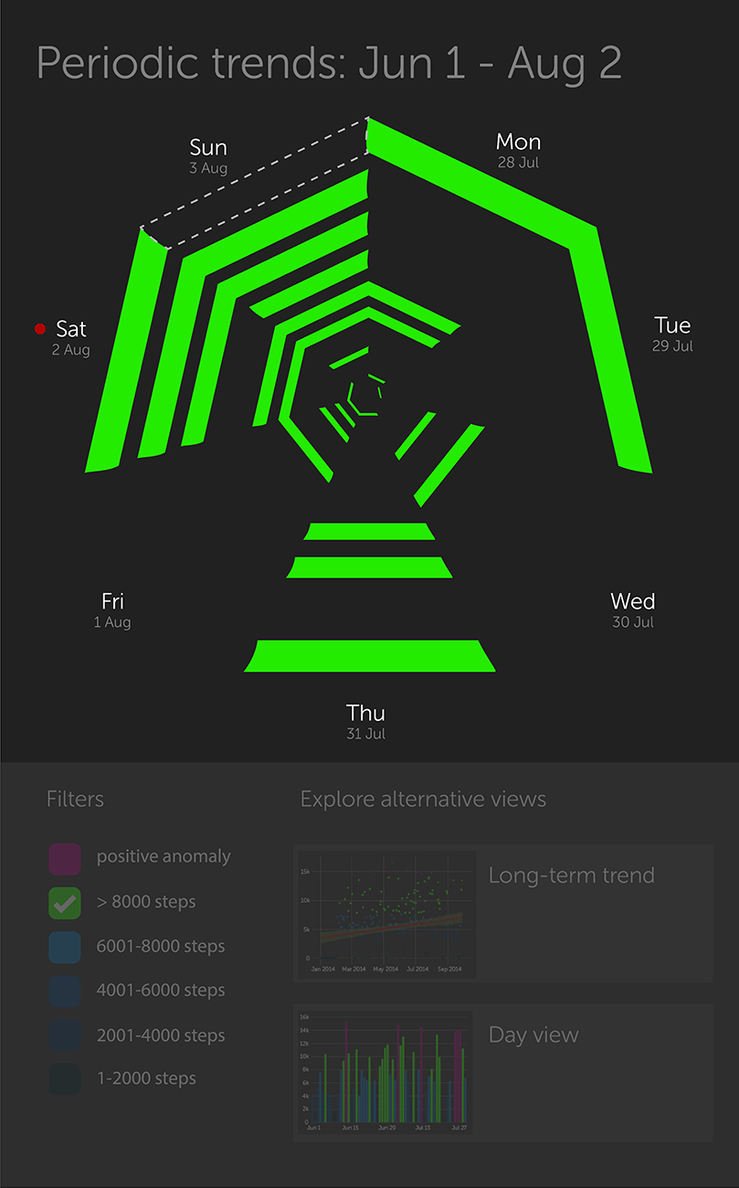
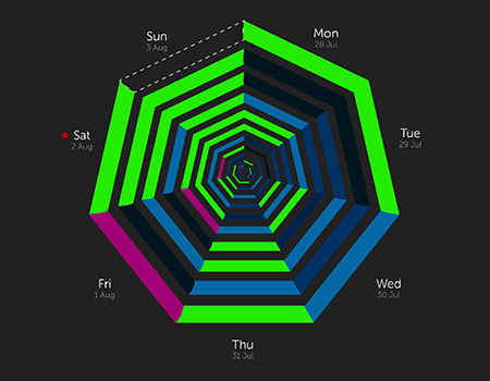
There seemed to be a gap in the literature around discovering periodicity in QS data despite the fact that young professional’s life is, in some ways, inherently periodic.

Spiral visualisations like the QS spiral [9,17] present an interesting alternative to traditional time-series charts. A continuous spiral timeline can allow users to discover repetitive or periodic patterns in their data.

Although looking promising, the QS spiral has not been tested with users and therefore its efficiency is not known. Judging from the provided pictures, it is not very easy and straightforward to navigate. Could there be a way to visualise data periodicity while making the visualisation easy to navigate?

Tools I used

  • Pencil and paper
  • Exploratory.io (a data science tool based on R)
  • MS Excel
  • Adobe Illustrator

Solution

I considered a generic mobile app as a platform for proposed solutions as most commercial products like FitBit or Jawbone use smartphones as a primary device for data visualisations.

QS Heptagon

I propose a new data visualisation, QS Heptagon, that builds on the QS Spiral metaphor mentioned earlier. IQS Heptagon's seven segments represent days in a week. The closest heptagon to the user represents the current week while the heptagons inside represent past weeks - the smaller, the more in the past. The user could "zoom in" to go back to the past.

This allows users to discover periodic events easier - especially when combined with a smart filtering (see pictures below).

The colours represent different data clusters (in my case step ranges).

QS Heptagon: Dimmed view facilitating focus
QS Heptagon: Active interaction view
QS Heptagon: Filter applied

Alternative views

Two alternative views to QS Heptagon could be also considered so that users could see overall trends more clearly. I describe those more clearly in the paper below.

Alternative step-count views: Scatter plot with a trendline
Alternative step-count views: Clustered bar chart

Multi-faceted views

The tree visualisations below would allow users to gradually increase the granularity of the data thus diving deeper into why a certain event could occur. This is important for discovery of hidden interrelationships between data that are currently missing in most commercial products.

Multi-faceted view: Information about a day provided on tap
Multi-faceted view: A detailed view of a day
Multi-faceted view: Path and Expenditures filters ON

Project paper

If you are interested in learning more about the project, have a look at the paper (unpublished). I describe the model and visualisation in more detail and I also suggest how an evaluation of the visualisations should be carried out.

Lessons learnt

This project was interesting and rewarding in many ways. It showed me how a rigorous literature review can naturally lead to new ideas – finding the gap. I also discovered Exploratory, which is a really powerful and user-friendly data science tool. Lastly, following Yau's book Visualize This was really helpful in learning how to turn R-based visualisations into more polished ones using Illustrator.

References

  1. Baumer, E.P.S. Reflective Informatics. Proceedings of the 33rd Annual ACM Conference on Human Factors in Computing Systems - CHI ’15, ACM Press (2015), 585–594.
  2. Consolvo, S., Libby, R., Smith, I., et al. Activity sensing in the wild. Proceeding of the twenty-sixth annual CHI conference on Human factors in computing systems - CHI ’08, ACM Press (2008), 1797.
  3. Cuttone, A., Petersen, M.K., and Larsen, J.E. Four Data Visualization Heuristics to Facilitate Reflection in Personal Informatics. In 2014, 541–552.
  4. Epstein, D.A., Ping, A., Fogarty, J., and Munson, S.A. A lived informatics model of personal informatics. Proceedings of the 2015 ACM International Joint Conference on Pervasive and Ubiquitous Computing - UbiComp ’15, ACM Press (2015), 731–742.
  5. Fan, C., Forlizzi, J., and Dey, A.K. A spark of activity. Proceedings of the 2012 ACM Conference on Ubiquitous Computing - UbiComp ’12, ACM Press (2012), 81.
  6. Fleck, R. and Fitzpatrick, G. Reflecting on reflection. Proceedings of the 22nd Conference of the Computer-Human Interaction Special Interest Group of Australia on Computer-Human Interaction - OZCHI ’10, ACM Press (2010), 216.
  7. Jin, S.-A.A. Avatars Mirroring the Actual Self versus Projecting the Ideal Self: The Effects of Self-Priming on Interactivity and Immersion in an Exergame, Wii Fit. CyberPsychology & Behavior 12, 6 (2009), 761–765.
  8. Langer, E.J. and Rodin, J. The effects of choice and enhanced personal responsibility for the aged: A field experiment in an institutional setting. Journal of Personality and Social Psychology 34, 2 (1976), 191–198.
  9. Larsen, J.E., Cuttone, A., and Lehmann, S. QS Spiral : Visualizing Periodic Quantified Self Data. Personal Informatics in the Wild: Hacking Habits for Health & Happiness — CHI 2013 Workshop, (2013), 5–8.
  10. Li, I., Dey, A., and Forlizzi, J. A stage-based model of personal informatics systems. Proceedings of the 28th international conference on Human factors in computing systems CHI 10, (2010), 557.
  11. Li, I., Dey, A.K., and Forlizzi, J. Understanding my data, myself. Proceedings of the 13th international conference on Ubiquitous computing - UbiComp ’11, ACM Press (2011), 405.
  12. Li, I., Dey, A.K., and Forlizzi, J. Using context to reveal factors that affect physical activity. ACM Transactions on Computer-Human Interaction 19, 1 (2012), 1–21.
  13. Lin, J.J., Mamykina, L., Lindtner, S., Delajoux, G., and Strub, H.B. Fish’n’Steps: Encouraging Physical Activity with an Interactive Computer Game. In P. Dourish and A. Friday, eds., Springer Berlin Heidelberg, Berlin, Heidelberg, 2006, 261–278.
  14. McLean, N., Griffin, S., Toney, K., and Hardeman, W. Family involvement in weight control, weight maintenance and weight-loss interventions: a systematic review of randomised trials. International Journal of Obesity 27, 9 (2003), 987–1005.
  15. Murray, T., Hardy, D., Spruijt-Metz, D., Hekler, E., and Raij, A. Avatar Interfaces for Biobehavioral Feedback. In 2013, 424–434.
  16. Rooksby, J., Rost, M., Morrison, A., and Chalmers, M.C. Personal tracking as lived informatics. Proceedings of the 32nd annual ACM conference on Human factors in computing systems - CHI ’14, ACM Press (2014), 1163–1172.
  17. Weber, M., Alexa, M., and Muller, W. Visualizing time-series on spirals. IEEE Symposium on Information Visualization, 2001. INFOVIS 2001., IEEE (2001), 7–13.